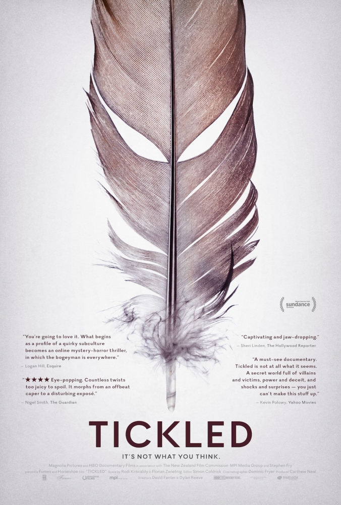
Tickled is a documentary that dives into the world of competitive tickling. The poster is very simple. There is a huge feather in the middle of the poster, which is a sign that relates to and is associated with tickling. This gives the audience an idea of what the film is about in the most simple way possible. Positioned below the feather is the title of the film. This, again, is very basic and gets straight to the point. To either side of the feather there are quotes taken from reviews of the film. This is a way of encouraging people to see the film, as well as providing some information about the film. The top right one kind of gives some small details on what the film is about. It is written in a way which is encouraging people to see the film. There is also the logo for SunDance which is a well known film festival. This, again, encourages audiences to see the film as it gives it a level of acclaim. The tagline of the film reads “It’s not what you think.” which gives an indication that the documentary is more interesting than just people being tickled. It is also vague and intriguing. This is important for a documentary as the audience has to know that the documentary will be interesting, so that they will actually want to watch it. By using this intriguing tagline audiences will want to come and see what the film is about. The spacing for the font that has been used has ‘Loose tracking’ and is sans serif.
The colours used in the poster are quite basic. The white background may be used as it is a calm colour, and you do not associate tickling with anything negatively, however this is contrasted by the dark text, suggesting that there may be something more sinister to it than just a tickling competition. The font is pretty basic.
